Summary
The self-directed learning industry is gathering more and more pace nowadays. One of the most common ways in this learning model is via YouTube educational content, which provides easy access to all types of knowledge.
With a lot of positive gain as a result of easy access to tutorials, users are also experiencing some hurdles and difficulties. This article discusses the potential challenges of using YouTube for educational purposes and offers suggestions for overcoming these challenges.
•••
Challenges and Pain Points
When going through YouTube and comparing some other leading online education sites such as SkillShare and Udemy. Among many differences, it is easy to notice that while YouTube has a tremendous amount of educational content, the platform is missing some critical information structure that provides users a scannable and accurate understanding of the video content. Users have to go through a lot of videos within the list to determine whether the content is a good fit. Some improvement is needed here.
Pain Point 1: Youtube page has low information gain for education content (cost of finding the right info is too high)
Research 5 main service providers in the online education industry to see how others already catered to hungry and thirsty souls.
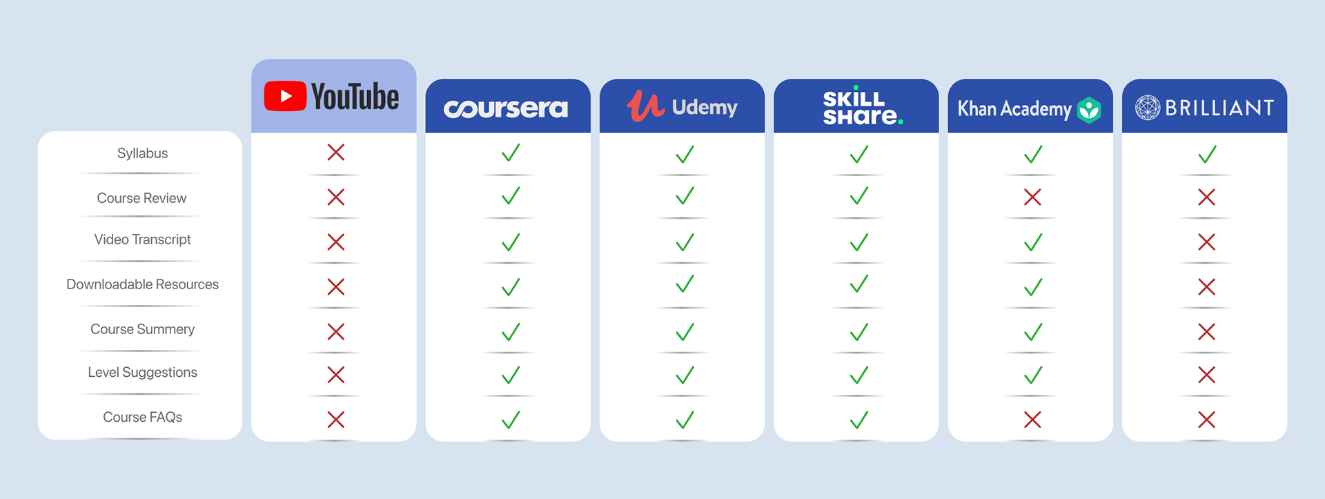
Information Components Comparison Chart
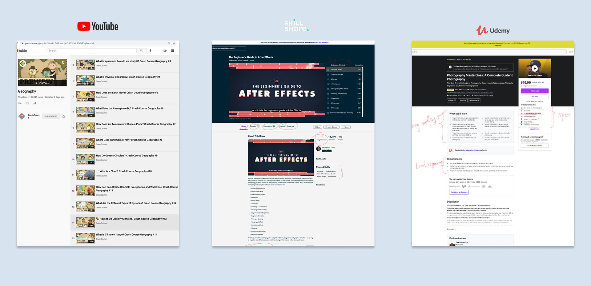
Sample of Information Layouts on Course Pages
The main finding is that users seem to browse faster and get more relevant information with well-structured pages that contain information such as course summary, syllabus, transcript, FAQ, supporting documents, reviews, and credits, etc.
To further validate the pain point above, we researched some academic reports and found a related one with the topic of Users’ Information Foraging behavior on the Web.
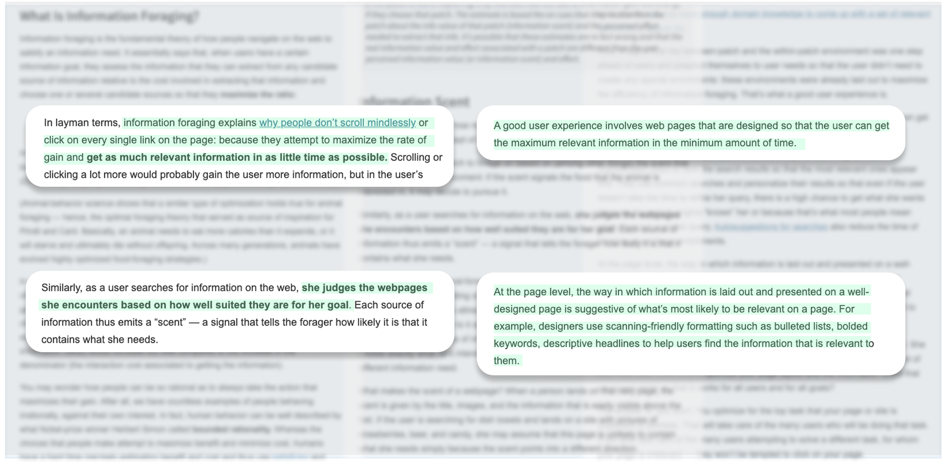
Information Foraging: A Theory of How People Navigate on the Web ( Raluca Budiu on | Published online: Nov 10, 2019)
The main findings are listed below:
•Users judge the web pages they encounter based on how well-suited they are for their goal. They attempt to maximize the rate of information gain over time: they want to get as much information as possible in the minimum amount of time.
•A good user experience involves web pages that are designed so that the user can get the maximum relevant information in the minimum amount of time.
•At the page level, how information is laid out and presented on a well-designed page is suggestive of what’s most likely to be relevant on a page. For example, designers use scanning-friendly formattings such as bulleted lists, bolded keywords, and descriptive headlines to help users find relevant information.
Pain Point 2: YouTube has low engagement components throughout the course
When it comes to educational content that requires self-direct, self-control, focus, and concentration, challenge is, Youtube doesn’t have the necessary tools to help enhance that.
To validate our finding, We again went through 5 main competitors in the online education industry to see how others already catered to users.
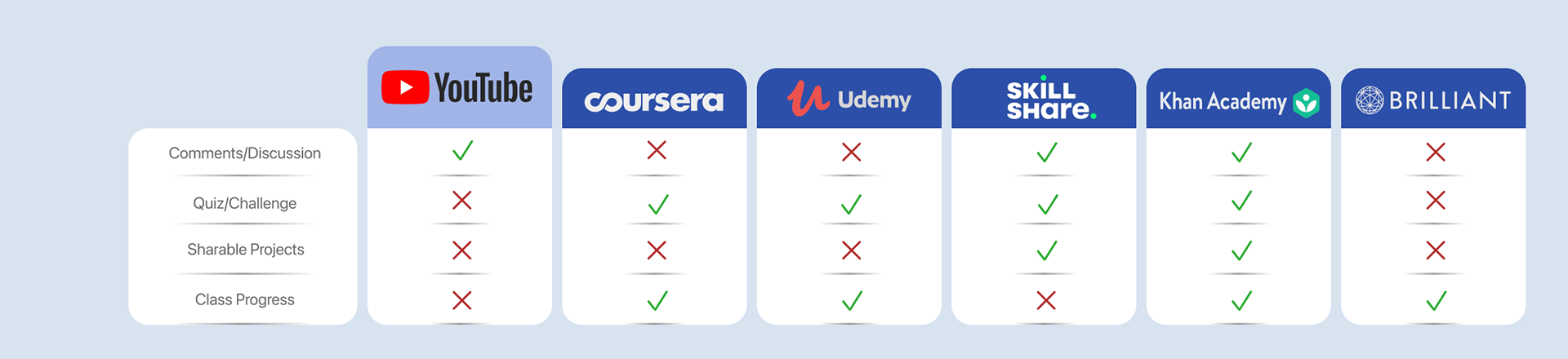
Interactive Components Comparison Chart

Interactive Components Comparison Chart
Some main findings:
•Users seem to enjoy interacting with other users of the same class online for informational purposes (e.g. joining discussions for a course project, discussing the video content, etc.)
•Compared to others in the self-directed learning industry-standard, YouTube is missing interactive enhancement elements such as quiz, discussions, making learning or educational videos less helpful and not fulfilling their potentials.
To further validate these pain points, we researched some reports related to our topic and had a chance to try them on a few platforms. From there, we got bulletin points to better organize what is learned from reports.
Reports with topic including but not limited to
1. Adaptability to a Sudden Transition to Online Learning During the COVID-19 Pandemic: Understanding the Challenges for Students
(Avi Besser, Gordon L. Flett, Virgil Zeigler-Hill | Published online: 15 Jun 2020)
(Avi Besser, Gordon L. Flett, Virgil Zeigler-Hill | Published online: 15 Jun 2020)
2. Best Practices for Implementing Remote Learning
(Hani Morgan| Published online: 28 Apr 2020)
(Hani Morgan| Published online: 28 Apr 2020)
The most salient points were:
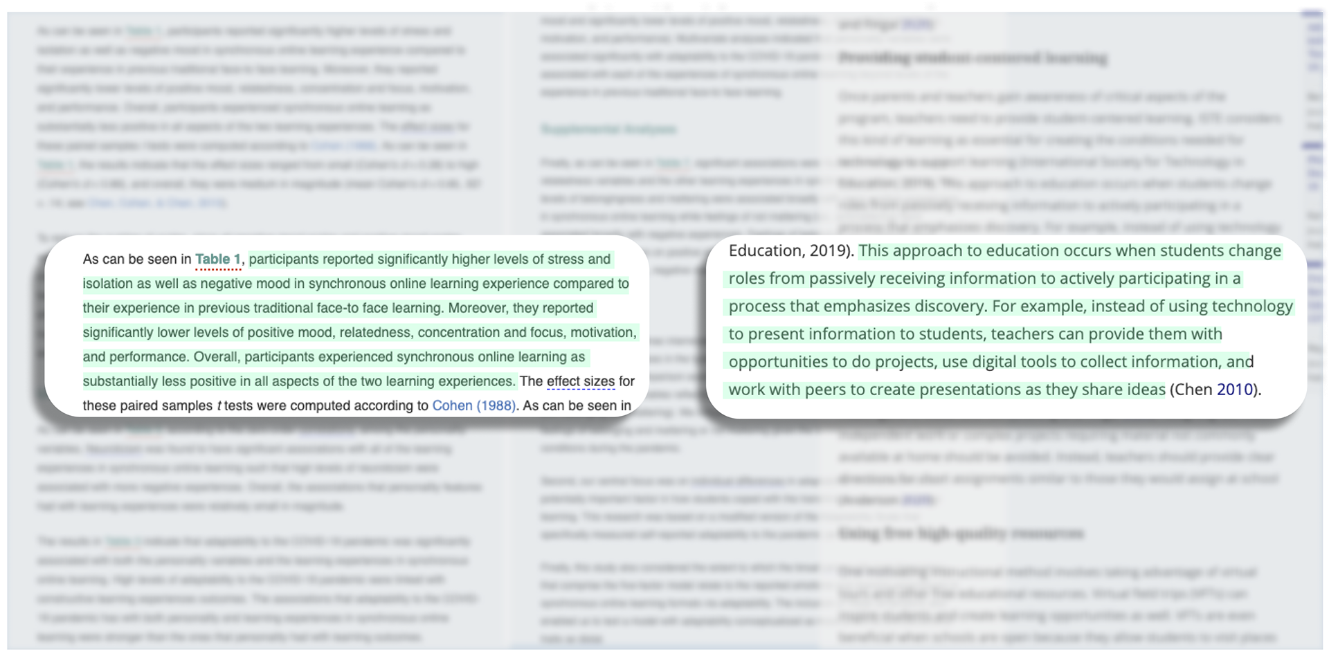
•Users reported significantly higher levels of stress and isolation as well as negative moods in synchronous online learning experiences compared to traditional face-to-face learning. Moreover, they reported significantly lower levels of relatedness, concentration, focus, motivation, and performance.
•High levels of adaptability were linked with constructive learning experiences. High levels of belongingness and mattering were associated broadly with more positive experiences in online learning.
•Students change roles from passively receiving information to actively participating in a process that emphasizes discovery. Content creators can provide user-centered learning with opportunities to do projects, use digital tools to collect information and work with peers to create presentations as they share ideas.
These findings not only validate our pain points, but they also provide us few directions to solve the challenges. Next, we will be doing design for possible solutions.
•••
Design
Low-Fidelity Sketching
After collecting ideas, here are possible solutions to pain points to increase YouTube online learning experience.
To solve Pain Point 1 with low information gain with educational content, the first fold page needs to have key information with low cost for obtaining that information. In layman’s terms, the course homepage needs to show users immediately and clearly what the course is about. Below is the solution.
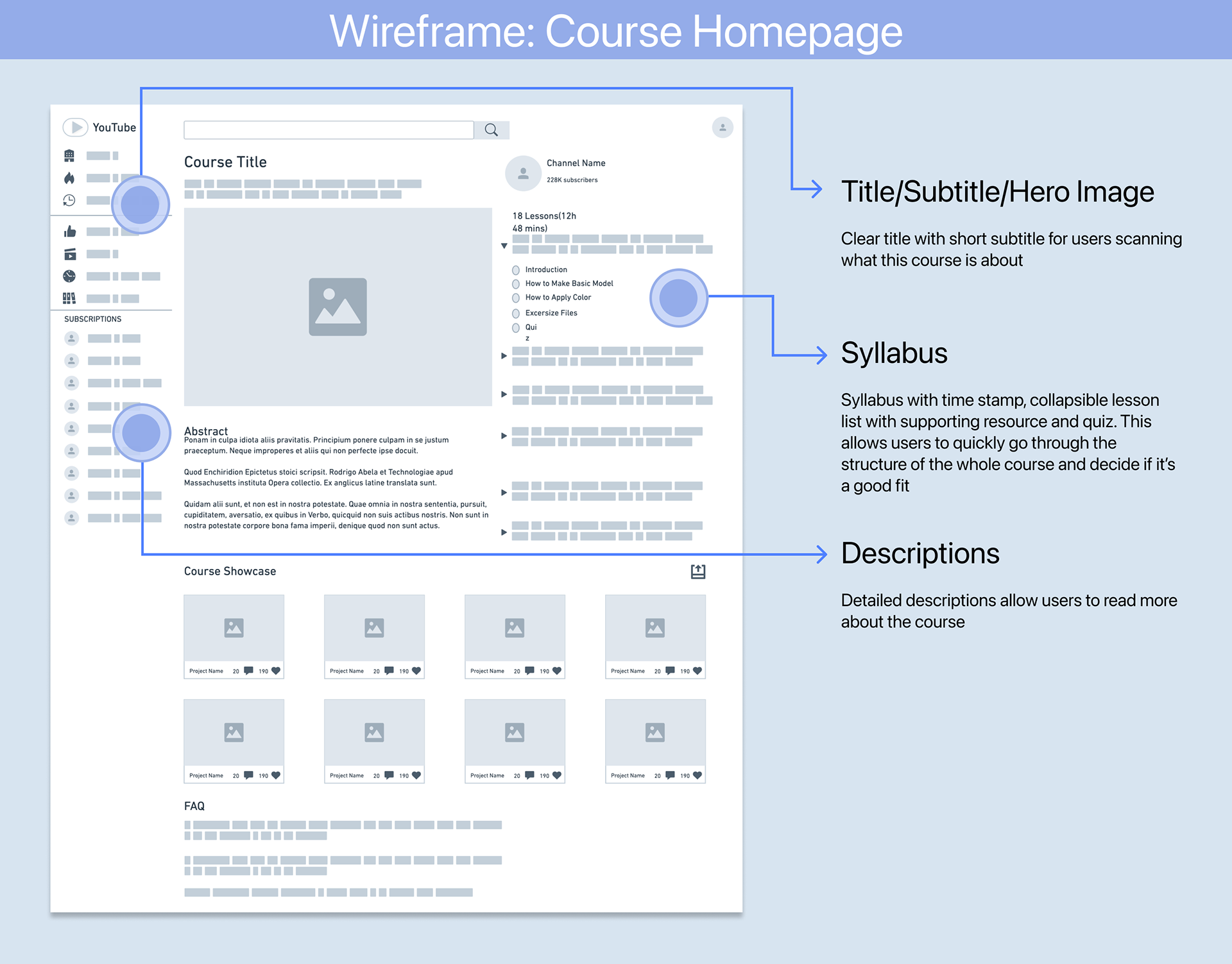
Course Homepage Low-Fidelity Sketching
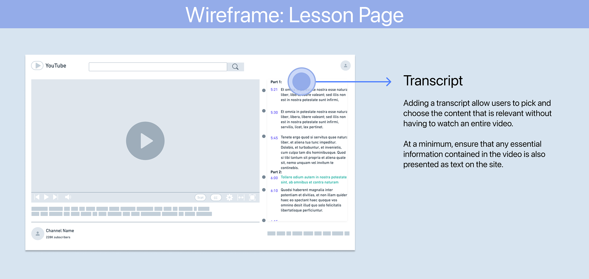
Lesson Page Low-Fidelity Sketching
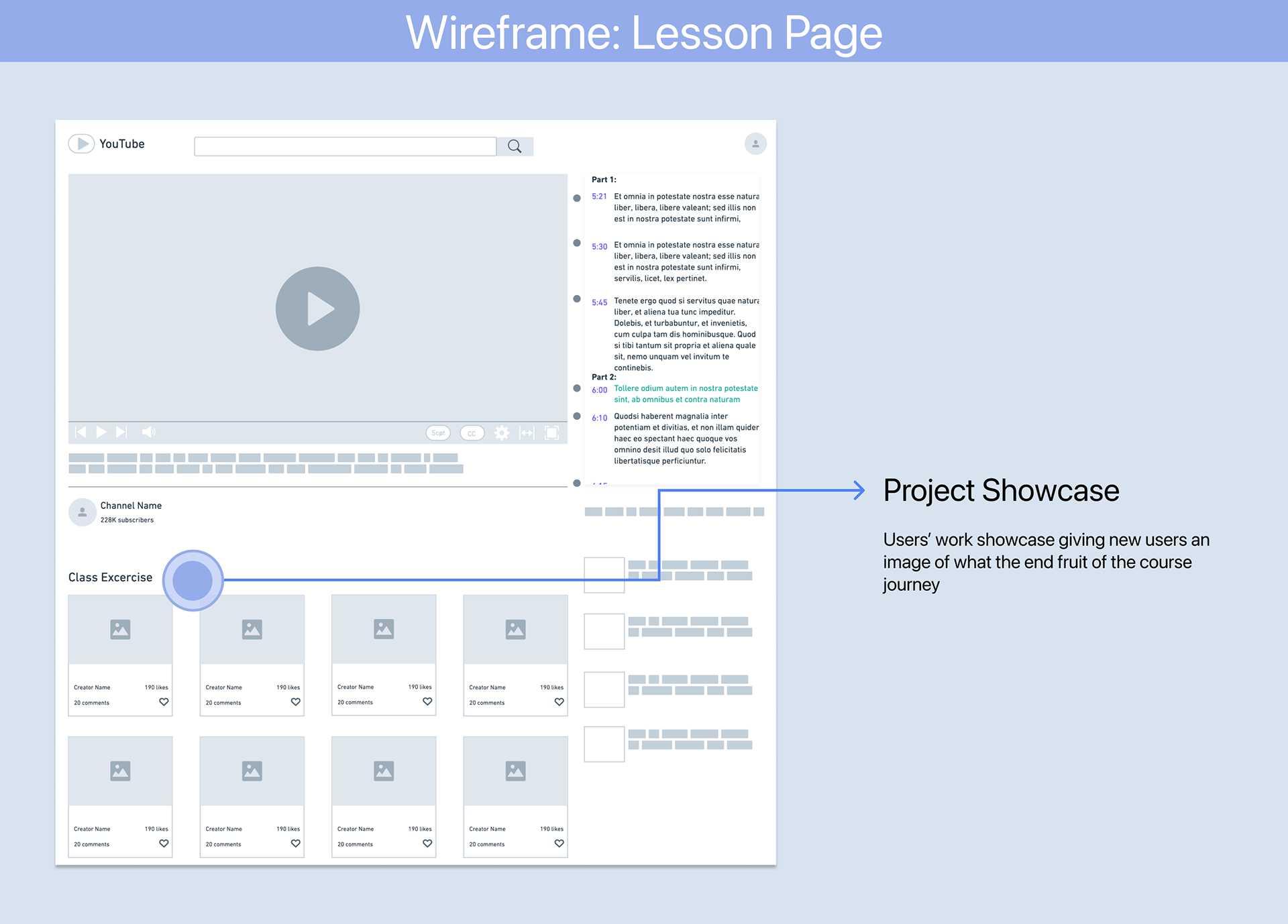
To solve pain point 2 by increasing the engagement, a few modals/components such as Course Project Showcase is added to allow comments/discussions. Also added a Quiz page to help users to memorize key content.

•••
High Fidelity Design
We then incorporated our ideas from wireframes into the prototypes to produce these deliverables.
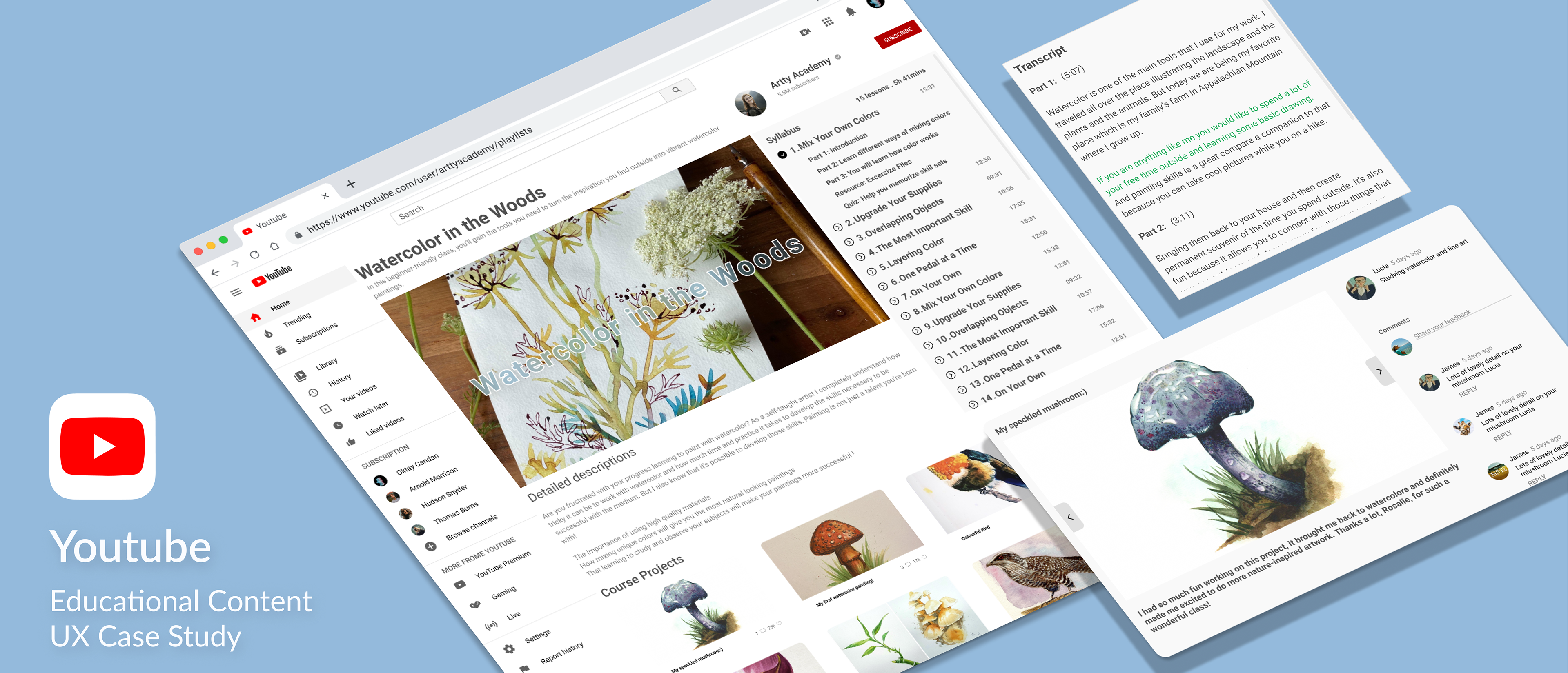
Course Homepage
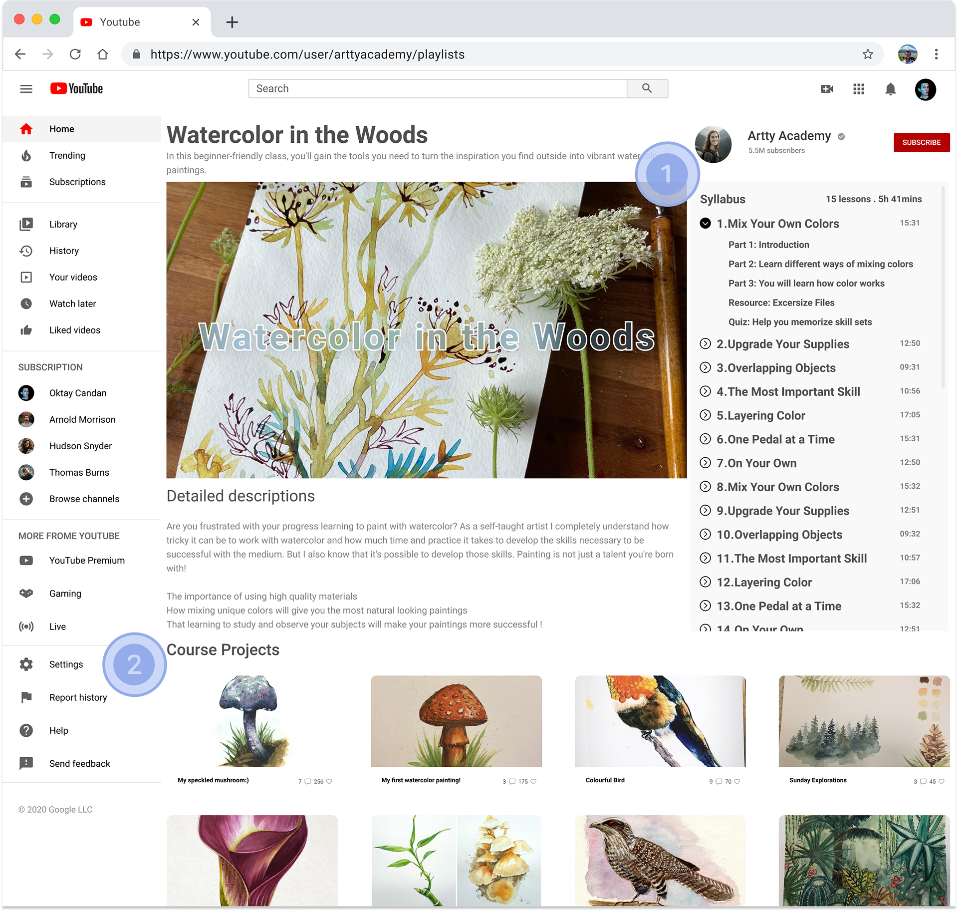
Course Homepage
1.Syllabus
•Collapsible Syllabus, users can scroll down to see the whole structure of each course.
•The timestamp on the right indicates the estimated time to finish the lesson.
•In addition, users can click the arrow to unfold each lesson to see details of each video which includes lesson structure, resource downloads, and quiz.
2.Project Showcase
•After finish the course, users can choose to upload their finished project to showcase to other users. The works are open to the public.
•The most liked/commented projects will appear in the top section.

Collapsible Syllabus Demo
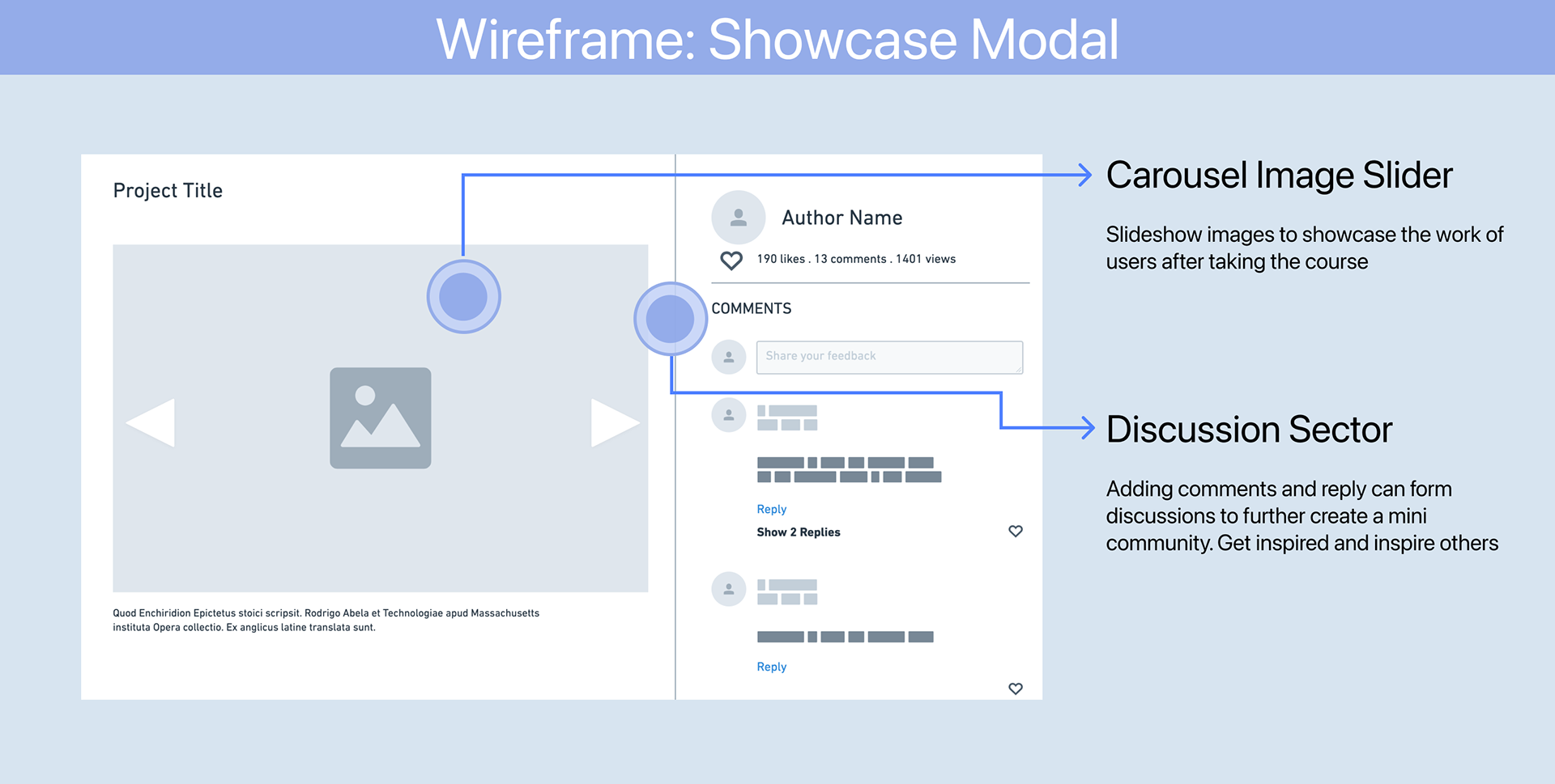
Showcase Modal

Showcase Demo
•When clicking on the thumbnail, a showcase modal will pop up and users can see details including titles, likes, comments, and replies.
•Click the arrow to see more works from the author.
•Adding comments or replies here to form discussions and further create a mini-community to get inspired and inspire others.
Lesson Page
1.Transcript

Transcript Auto Scrolling Demo

Transcript Manual Scrolling and Navigation Demo
•The transcript will automatically scroll down to match the speech of the video. The current sentence will be highlighted around the middle part of the transcript modal
•Click on the transcript will direct users to the exact content in the video’s timeline.
•Users can scroll down to scan the whole transcript. This allows users to choose the content that is most relevant without having to watch the entire video.
•The timestamp on the left side help users navigate through the video
2.Quiz

Quiz Page Demo
•When clicking the quiz link in the syllabus, a quiz modal will appear on the video player
•Users can flip pages to answer questions before they submit their answers
•••
Outro
It was incredibly rewarding to work on this project. I watch a lot of tutorials on YouTube and the pain points are real for me. I’m especially thankful to Lance Liu for his help. Being able to justify design choices and explain them is so important, and I’m grateful that Lance always had the best questions to ask about my choices.
In terms of development as a designer, I learned that even with some products that one gets so used to on daily basis and seemingly working just fine, there is room for improvement. Because context changes with new content, new users group appears and grow, so as their needs. Keep a curious heart and willing to try new things will get you a sharper sense when it comes to user experience improvement.
Project Detail
Timeline: March 2021 — April 2021
Roles: Jackie Zhang (UX, UI, Animation)
Special Thanks: Lance Liu
Product/Service: YouTube Web
Platform: iOS/Chrome
Roles: Jackie Zhang (UX, UI, Animation)
Special Thanks: Lance Liu
Product/Service: YouTube Web
Platform: iOS/Chrome